Showing posts with label balance. Show all posts

Sunday, February 5, 2012

SIMPLICITY (AKA the IKEA RED KITCHEN)

For a lot of us, this is a life goal:  to achieve a balanced, simple, uncluttered existence.  It can be a challenge in today's society!  But you can accomplish this in your surroundings.  Whether your interior is contemporary or traditional, or anywhere in between, you can eliminate clutter, live with what means the most to you, and let go of the rest.

I have been very blessed to work with Doug to help him attain this harmony in his San Francisco apartment.  Stillness is sacred.  You feel that when you enter Doug's space. 

We are not quite finished yet, but I was out in San Francisco at Thanksgiving so I took these photos.  We'll update in a few more months, after our silk TAI PING rug arrives from China, and after we install our solar shades and dimmers.

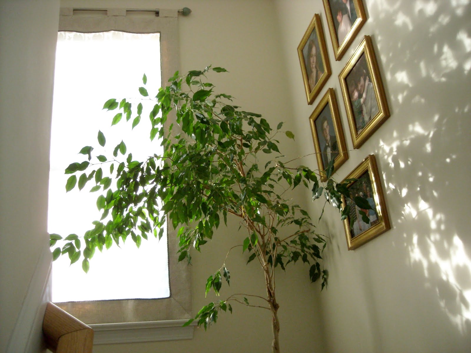
But for now, here's an abbreviated tour of Doug's renovated apartment, with my comments on Interior Design as Art......


Doug and I share a passion for original art and 20th century furniture classics, and that has made this project one of my all-time favorites.  Doug's friend Susan Tibbles is the artist for this set of mixed media assemblages from her "Swank Box Series."  The shadow boxes were originally from the Swank Jewelry company, where they were used to store various components in the manufacture of their jewelry.  Each of the boxes is filled with a melange of fascinating miniature vintage finds, and each box has an individual title by the artist.  Once you begin exploring them, it's hard to tear yourself away!  (For a closer look, see the enlargement below - and to magnify it even further - increase the zoom level on your monitor.)

Tibbles' work embodies "a sense of wit and political consciousness," and she has "a unique ability for assigning dual meanings to commonplace objects" (quoted from Gallery Ocho, Santa Barbara).

Here's the closeup:


                                                             "SWANK BOX SERIES"   by Susan Tibbles

To learn more about Susan Tibbles and her unique work as an artist, as well as her extensive work as an illustrator for the L.A. Times Opinion Page, visit her website at


Contemporary art is all about juxtaposition.  Elements of line, form, color and texture are combined by the artist to create a unique work.  Sometimes the artist has a particular objective in his work - a social or political statement.  Sometimes the intention is simply to engage or delight the viewer.

Doug's apartment is a wellspring of juxtaposition.  One might think that this would cause clutter, but when properly edited, it creates just the right amount of tension to keep you thoroughly engaged. 
                  

Take, for example, this classic TRAVE table, with its simple glass candle ornaments on top.  This is Doug's doing - his canvas.  I've loved working with him because he has such a wonderful sensitivity for balance.  Look at the angles in the table base - so beautifully and simply counterpoised by the 3 glass spheres.  And the one blue sphere picks up the blue light in the stainless LED wall switch nearby (see photo below). 

This composition of the dining table is Doug's self-expression.  My "artist role" as editor is to be sure it is in harmony with everything else in the space.  My "techician role" as interior designer is to be sure that everything in the space conforms to health, safety and building standards, and to provide sources for the products needed to accomplish this.


SWANK BOXES by Susan Tibbles,  Stainless/Blue LED Lutron Lighting Control, TECH LIGHTING round stainless transformer for track lights

From the dining area you peek through to the red Ikea kitchen.  The raised bar hides the cooktop on the other side.  The soapstone counters and Black Empress granite mosaic add elegance, while still maintaining our theme of SIMPLICITY:


Doug's apartment is all about detail.  To make sure that we controlled every detail within our power to control, we worked together for months prior to and during the installation.

To revisit the construction portion of this project and to see the BEFORE pictures, click here:
http://swestdesign.blogspot.com/search/label/san%20francisco%20ikea%20kitchen


The beautiful reflection we get off the polished granite mosaic is a perfect backdrop for Doug's antique Thai bamboo container.  Several hundred years old, and given to Doug by an archaeologist friend, this piece is carved out of a single piece of bamboo, hollowed out inside, and fitted with an interior bamboo tray.  (And the special order Lutron receptacle in black is almost invisible....)  The mosaic technique is 1000s of years old, and much of the earth's granite is PreCambrian - this is another miniature "canvas" of juxtaposition in the apartment.

Take a close look at the center of the above photograph.  Doug's skyline view of San Francisco from the 10th floor of his apartment is reflected in the glass fronts of his Ikea kitchen.  It's magical!!


Also in the dining area is Doug's copy of the iconic Mackintosh Hill House Chair, designed by scottish architect Charles Rennie Macintosh in 1902-1903.   The original still resides in the bedroom of the Hill house in Helensburgh, Scotland, 20 minutes from where Doug used to live when he was working out of Scotland.

Above the Hill House chair hangs a Susan Tibbles work:  "Unzipped"  ......another study in contrasts:  the geometry of the chair is perfectly balanced by the soft curves and wispy feathers in the artwork.

                                                                                 "UNZIPPED"   by  Susan Tibbles

There is also a Tibbles piece in the kitchen - a special gift to Doug - a single long-stemmed rose entitled "Valentine Love Monster":


The luxurious finishes in Doug's space provide worthy surroundings for his beautiful art collection.  Once inside the kitchen, the rich red and black furnishes an elegant backdrop for food preparation.  But it is completely practical.  Soapstone requires no maintenance.

The cabinets run all the way to the ceiling to provide generous storage for things out of sight.


The halogen lighting supplies ample task illumination, and Doug's Wusthof knives are hanging within easy reach of any kitchen task.   

Doug actually uses his kitchen!  He keeps his favorite items right on the counter, and the colors enhance the granite backsplash and the soapstone.


On the opposite side, the oven and cooktop are easily accessible, but out of view from the living/dining area.
*****

I believe that everyone is an artist in some way.  And I approach every project as an artist ready to collaborate with other artists, including (and especially!) you.  My job is to direct you in your self-expression through your interior space.
Collaborating with Doug has been one of the most personally rewarding projects in my career, because his appreciation and embodiment of art has guided every step we have taken.  Doug lives and breathes his art collection, and he loves to share it with visitors.  I am delighted with each phase of this project, as Doug continues to refine and add to his collection.  We'll post the rest of the art when we get the final photography later this year.
To read more about the juxtaposition of old and new in interior spaces, see my website page:
To read more about letting your own individuality be the creative canvas on which you build your interior space, and also how to work with commissioned art, see my page on ava living:
http://avaliving.com/room.php?rid=5613  (When you get to this page, it's counter-intuitive:  DON"T press NEXT under the photo....that will take you to the next featured designer and away from my page.  Instead, scroll down to see all the photos and the story behind this design.)

See you next time!

Posted by Picasa

Tuesday, February 15, 2011

The MAGIC of WINDOW TREATMENTS


There are many beautiful things in the manufactured universe, and FABRIC

is certainly one of the most magical. I have always loved fabric. I first recall being entranced by it as a child, when I discovered a bolt of vintage silk in my mom's closet. She had brought it with her from England. It was a delicious red color, and I could imagine a rajah's trappings to go with it. When I was twelve, my parents enrolled me in a sewing class at the local Singer store and I got to select the fabric and pattern for a dress (black and white checked gingham!) that I made myself (with zipper!). I was hooked. I loved walking the aisles of fabric stores wherever I could find them, and made many of my own clothes. I even made my wedding dress - an exquisite, simple, elegant Vogue pattern.


When I enrolled in the Interior Architecture and Design curriculum at Northwestern University, I discovered all the magic of interior fabrics. The showrooms at the Merchandise Mart in Chicago begcame my regular haunts! Rows and rows of fabrics and trims - surely this is Heaven!


Window Treatments are one of the most creative ways to enjoy beautiful fabrics. With the perfect balance of shape, color and texture, each treatment is a canvas, and that is exactly how I approach designing a window treatment.


Also wonderful to consider in your "window treatment canvas" is how the outside light plays into the mix. Different times of day produce different light effects, both in color and shadow, and the results can be thrilling, when you walk into a space and see the light dancing on your wall or floor through the pattern of your fabric or shutters.


I have a wonderful workroom that I have used for years. I specialize in very individual treatments, and this seamstress has all the background and skills to help me put my ideas together in the most practical form for the client. I am an artist, and I treat each project as a canvas specific to that client. I don't have any standard treatments. I start each treatment with an in-depth discussion with you to find out what you need and what you love. And then we work to narrow the field to those solutions that are right for you (including your budget). If you do want a "standard treatment" (simple pinch pleats, for instance), we have no problem executing it. But I love to put in a little detail that distinguishes your treatment from anyone else's...


I don't have a particular period. I love all interior design! I do traditional through contemporary based on the client's preferences. Clients usually come to me because they have specific needs and desires. My task is to coordinate all the elements that you love and fuse them into a cohesive whole. Creating a beautiful, individual project canvas is what I love to do!


All the above treatments were designed by me. Check out my new Window Treatment Slideshow to see more. These are not professional photos (I took most of them myself), but you can still get the idea! See the Slideshow link in the column to the right, just under my website url.


Saturday, September 19, 2009

DIMENSION RETURNS TO THE WOODS - HOORAY!!!!!!


Important notice: Dimension is returning to the woods. It happens in NC in September every year, and is one of my favorite times. After enduring the heat of August, and the flat landscape of everything green, dimension begins to appear. How does it happen? Take a look outside, and view it as a canvas: one tree begins to turn, and all of a sudden, everything is no longer flat.

Then as leaves slowly begin to drop, deeper areas of the woods come into view. Even if it’s still mostly green, you can see into the woods, and the shadows give depth to your canvas.


Try it. In this photo from Blowing Rock, the shadows around the tree trunks add the dimension. If you put your fingers over the green and dark tree trunk area at the left, and imagine that section of the photo to be orange, like the rest of the picture, you find that the dimension on that side of the photo goes flat.


You can see it also in marshy areas, where the water plants grow in clumps around each other. What was a solid sheet of green in August begins to have layers of brown and varying shades of fall, which add depth to the view. All of a sudden there is perspective in your picture, which was missing in August. This photo is from Moses Cone Park near Blowing Rock, but there is an even better example of layering of color right here in Cary at Crabtree Park. The section of Aviation Parkway that crosses Crabtree Lake is one of my FAVORITE places to view the changing seasons. Unfortunately, it is not an easy place to take a photo, because of the heavy traffic and lack of road shoulder. But next time you head to the airport, keep your eyes open as you cross the lake, and see what the season is doing.

What does this have to do with Interior Design? It’s an interesting thing to contemplate. In the case of the woods: by REMOVING something, you create dimension. In your spaces, where you may have a solid sheet of “things” too crowded to enjoy, a careful editing can reveal a balance and beauty of form that is nurturing and inspiring. In the cases of Moses Cone Park and Crabtree Lake: proper contrast and color balance add a perspective that makes a space seem bigger.


Dimension is an important quality of Life. It adds spontaneity to our spirit, and joy to our days! It keeps us fresh and ready for the next unfoldment of beauty, whether it be in our children’s artwork, our parents’ wisdom, our own sense of service, or our physical surroundings. All that perfection and beauty comes from the same Place, and is Life’s gift to us!